Industry
Financial Services
Services
Branding
Motion design
Typeface
Financial Services
Branding
Motion design
Typeface
Founded in 1767, Storebrand is a leading financial company focused on products such as insurance, pension, banking and investments. They have over 250 years of experience in safeguarding Norwegians' financial futures.
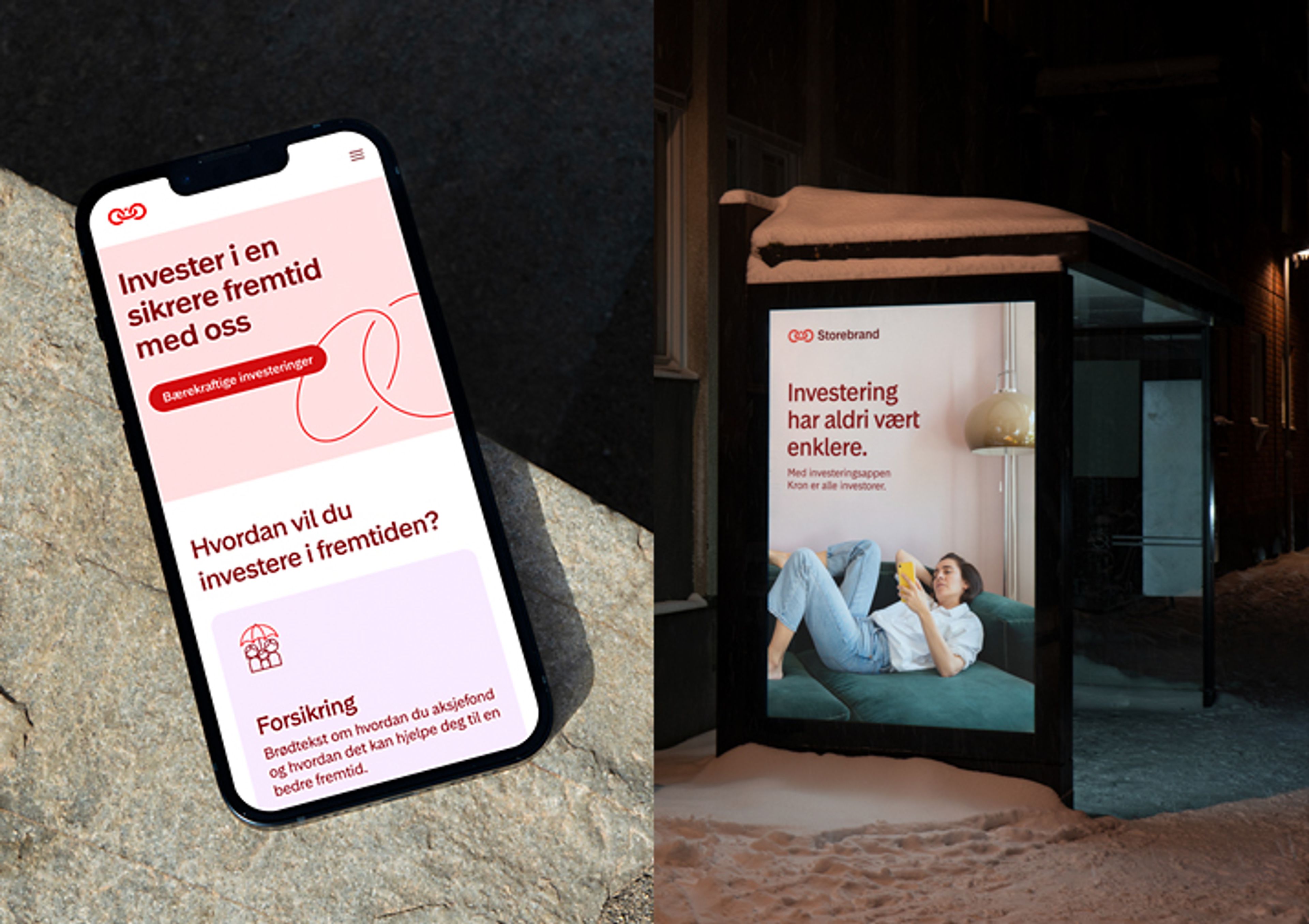
The previous identity was outdated and didn’t align with the new brand strategy - how good financial decisions today can help secure the future. We redesigned the logo, while preserving brand equity and introduced new meaning into the symbol. The ring in the middle representing the present, while the two others represent the past and the future. A dynamic design element was created inspired by the symbol and what it represents.
We developed a simple digital tool to efficiently explore and refine the symbol. This way we could easily test out dozens of variants and export as vector files for further consideration. The final logo was outputted through the tool.
A bespoke font, made in collaboration with Playtype, designed for both large and small sizes. The font was partly inspired by the curves and movement of the logo and design elements, with the aim to enhance cohesiveness within the new brand identity. Its design conveys qualities such as friendliness, dynamism, and trustworthiness, infused with a Nordic flavour. We aspired to create a design that strikes a balance between contemporary aesthetics and timeless expression, ensuring it remains relevant even a couple of decades from now.
We've crafted select characters to possess unique expressions, adding personality and recognizability to the typeface without compromising on readability. Subtle details, like the oval in the "å," (instead of the standard circle) were incorporated to establish a visual link with the logo and design elements, enhancing overall cohesion.
With a versatile but limited range of four weights and corresponding italics in both the Display and Text versions, the font is designed to be a workhorse while maintaining simplicity and user-friendliness.
Ensuring excellent readability in the Storebrand Text version, was of importance. Therefor we created a version based on the Storebrand Display font with minor adjustments to select characters along with slightly more open letter spacing in the text version for better legibility in body copy.
Charlotte Hillestad, Head of brand and customer experience, Storebrand
Awards