Industry
Office spaces and services
Services
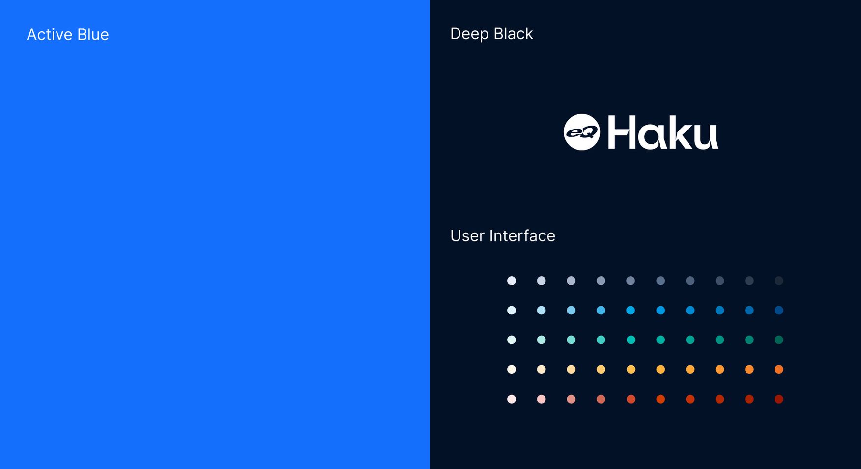
Visual Identity
Service design
UI/UX design
Content production
Technical architecture and implementation (headless)
Testing
Lead generation
SEO & SEM
Data and analytics
Office spaces and services
Visual Identity
Service design
UI/UX design
Content production
Technical architecture and implementation (headless)
Testing
Lead generation
SEO & SEM
Data and analytics
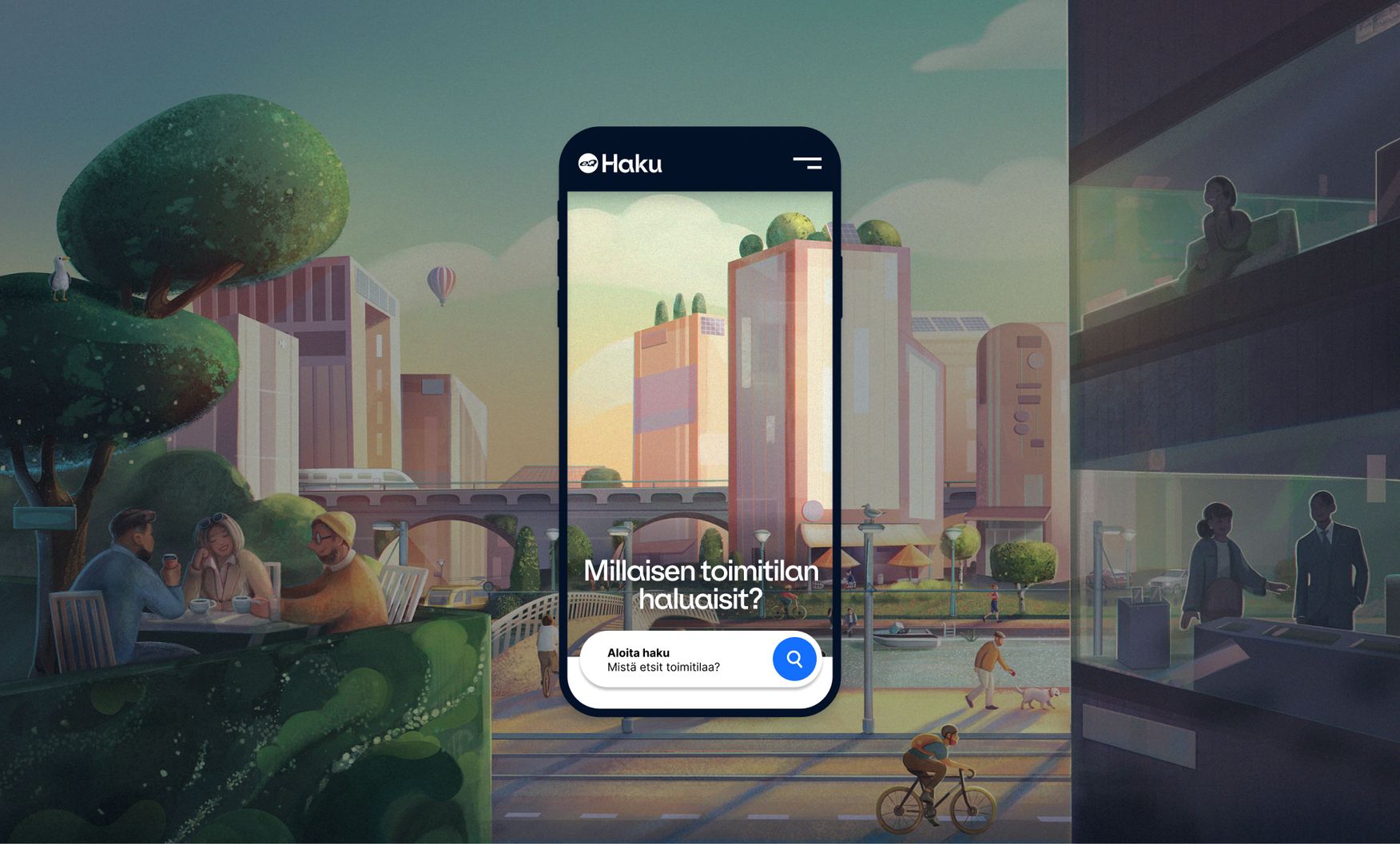
eQ Real Estate is one of Finland's most prominent commercial property owners, with over 200 properties and over 1 million square meters of rental space. The new brand was designed to be stylish, innovative, and forward-looking, representing eQ Real Estate as a trustworthy and responsible owner.
See the website here eqhaku.fi
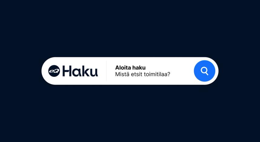
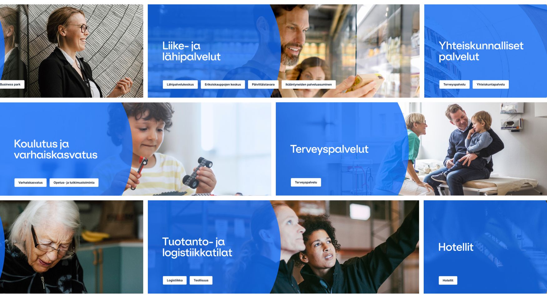
eQ Real Estate wants to offer customers an easy process for renting commercial spaces. From these starting points, the idea of a strong premises service concept, eQ Haku (eQ Search), was refined: a modern and high-level online service that enhances rental operations and customer experience. The concept was built on a straightforward, friendly communication method and an easily approachable search function.
The design phase was carried out in themed workshops, and the implementation phase was in sprints. A multidisciplinary team was involved in the design and implementation phase and together managed to create intuitive user paths for the site. As a result, once the site went live, it immediately started generating leads.
The further development of the site is very data-driven. We provide the client with continuous data and analytics services and base the design decisions on insights made from data. We established close working methods with the customer mainly through weekly meetings.
Since eQ Haku was rebranded (including the name), we needed a new domain. Because of this, it took some time to get the organic traffic to the same level as before, but now after eight months, we’ve reached the same level, and the number of visits has been growing steadily month by month. We’ve done a lot of work on eQ Haku’s SEO and getting good results.
Google’s Lighthouse :
100/100
desktop
99/100
mobile
Google’s “Best Practices” score:
100/100
desktop and mobile
The new site is a considerable improvement when compared to the old one, according to Google’s Performance and Accessibility metrics.