Client
FFO, Funksjonshemmede Fellesorganisasjon
Services
Brand Identity
Repositioning
Website
Office
Knowit Experience Oslo
FFO, Funksjonshemmede Fellesorganisasjon
Brand Identity
Repositioning
Website
Knowit Experience Oslo
One in every six people in Norway has a disability. FFO, or The Norwegian Federation of Organisations of Persons with Disabilities, is their umbrella organization. FFO and Knowit did an extensive transformation of their identity, positioning, and digital presence as a leading force for inclusivity and equality.
FFO is a leading charge in this battle, with 88 member organizations with nearly 400,000 members. Knowit’s goal was to develop a brand identity and digital platform clearly communicating FFO's mission: To champion a barrier-free society and assert the rights and opportunities for people with disabilities, paving the way for an equal society.
The rebranding needed to unify FFO's message both internally and externally, to member organizations and their members as well as the broader public, including policymakers, politicians, and the society at large.
The rebranding and repositioning has redefined FFO's identity and digital prescence.
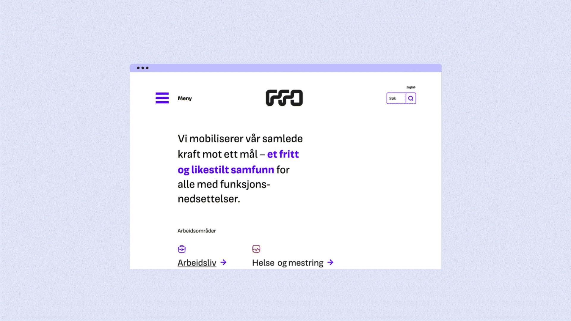
Previous insights had shown that many people found FFO’s role unclear. It was hard to get a grip on what they did and why. FFO struggled with information overload, with more than 6000 unique URLs on their website and a lot of identical content. This had to change in order to reposition them as Norway’s largest and most influential umbrella organization in their field.
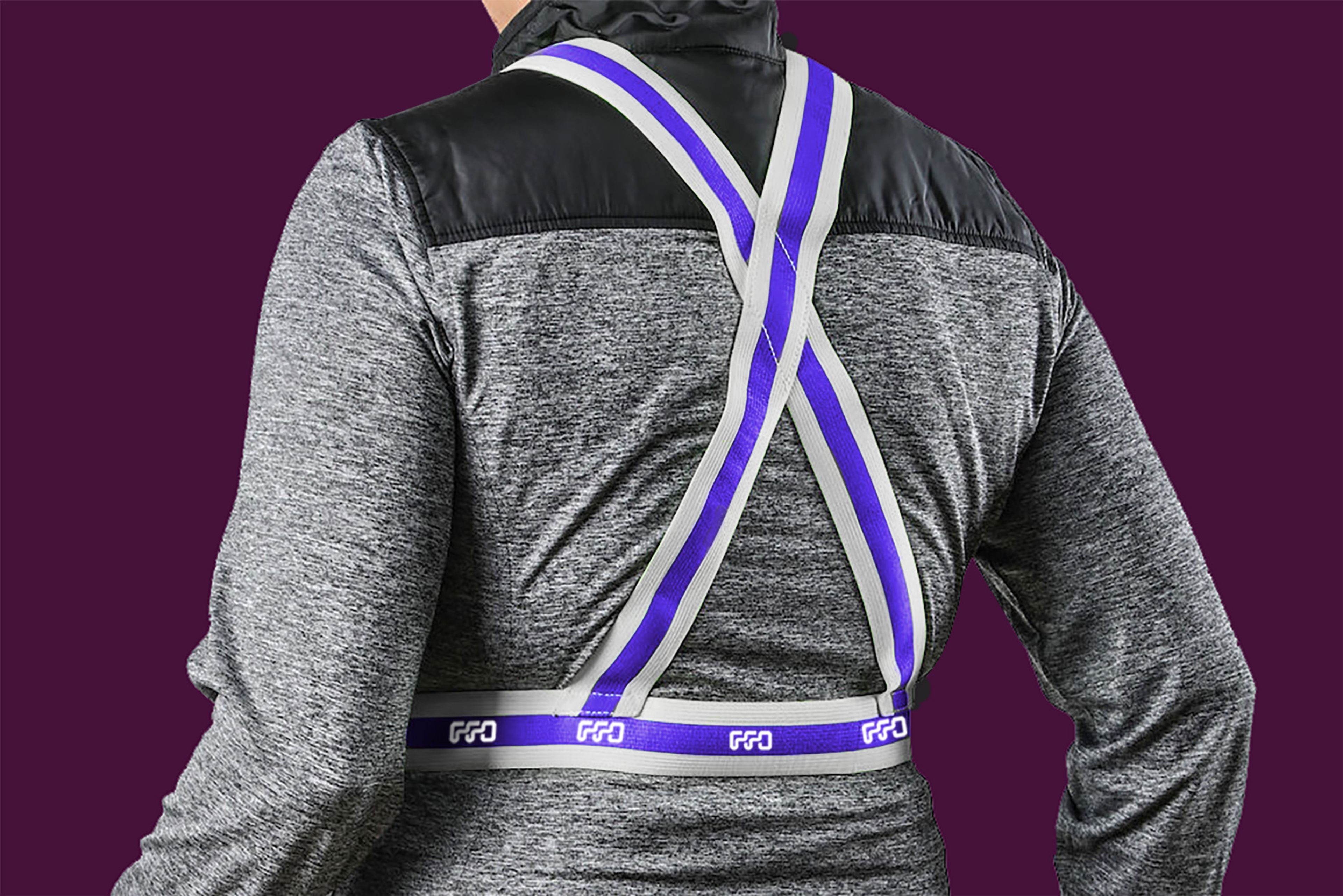
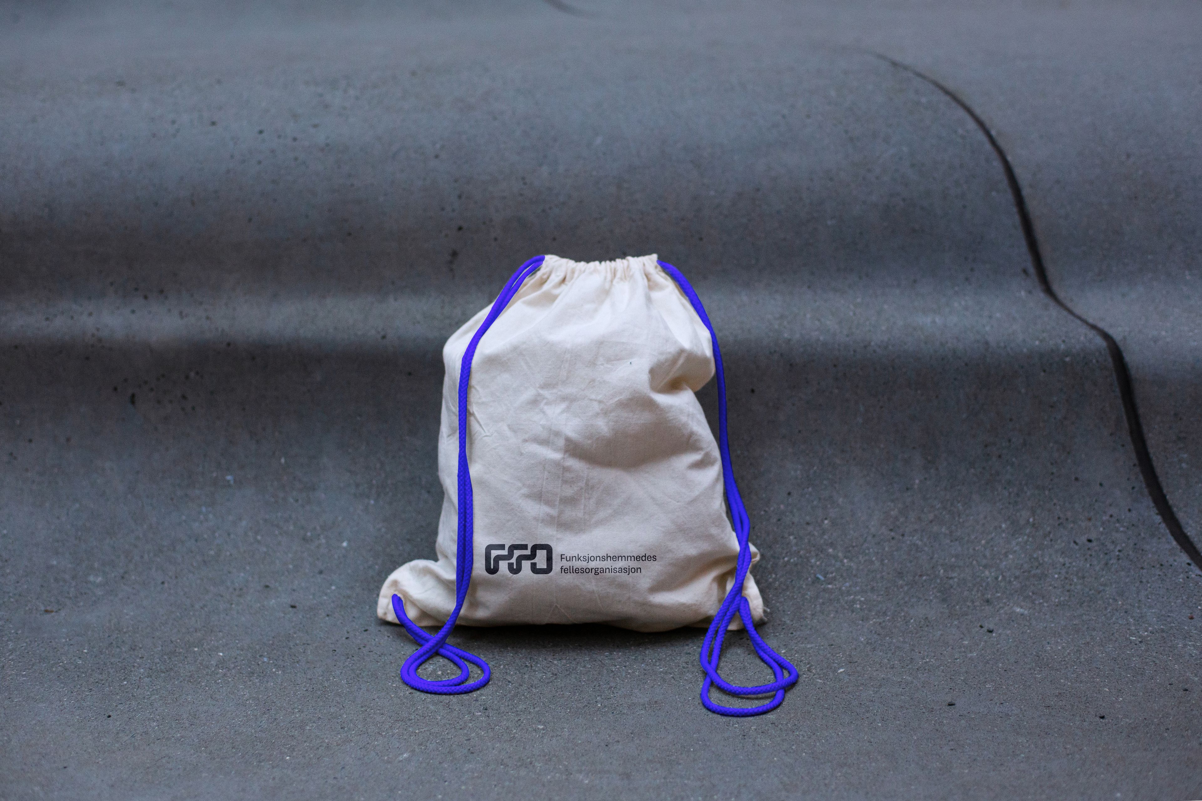
We introduced a fully loaded, thuroughly developed branding toolkit. With impactful visual elements, we ensured cross-theme recogniziblity, making sure to highlight FFO as a confident and professional leader on the field. A key component in the visual identity is the “path”, an elegant line that can be tailored through a versatile grid system, while communicating the vision of “paving the way” for an equal society. We also introduced a minimalistic color palette with few colors, led by the purple-blue “Blilla”. To ensure that the final delivery was user friendly and accessible, we did rigorous user testing, including sessions with the Norwegian Association of the Blind and Knowit’s Accessibility panel.
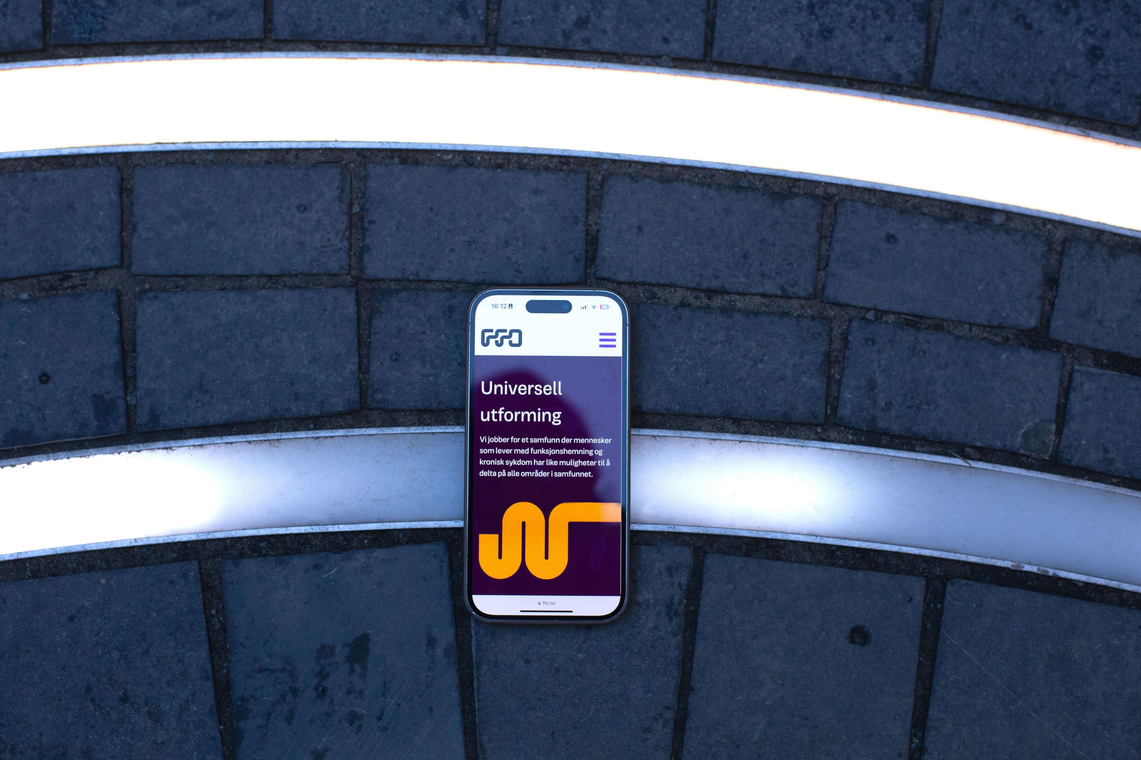
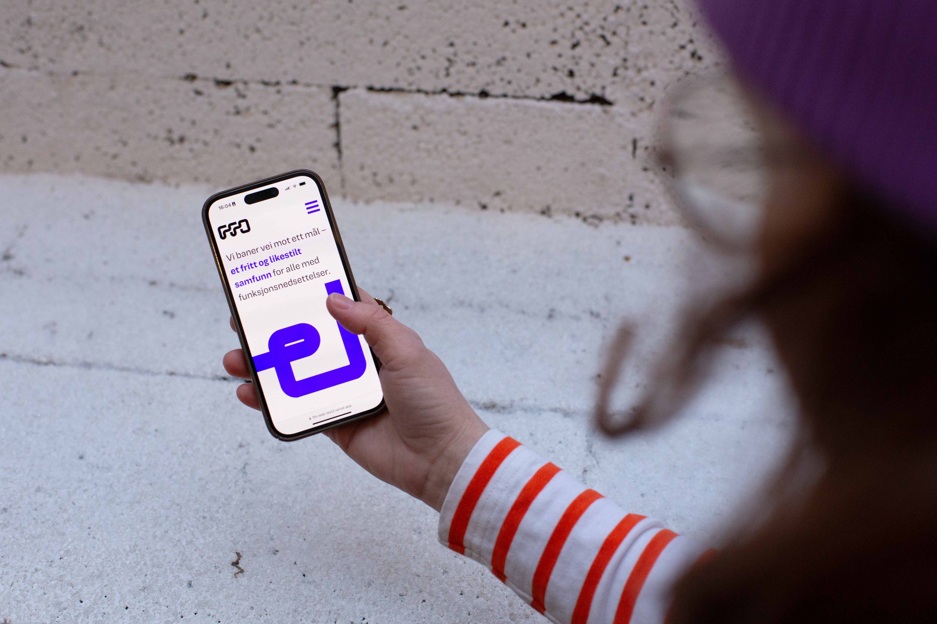
We quickly found that the website needed a thurough restructuring due to navigation issues and information overload. The new website is designed as a static web app. It emphasizes thematic content filtering, optimal user experience, and significantly improved accessibility, achieving high scores in Lighthouse evaluations. These transformations did not only streamline content delivery, but also improved the website’s performance and reduced CO2 emissions.
The new solution, based on the vision of “paving the way” for an equal society, embodies FFO’s commitment to inclusivity and its role as vanguard for the rights for people with disabilities. The new, unified brand voice and digital platform is designed to engage various stakeholders and amplify FFO's advocacy for equality, participation, and freedom.
In summary, FFO's strategic rebranding and digital transformation have set a new standard for organizational representation in the digital age, emphasizing a modern, inclusive, and effective approach to advocacy and community engagement.